


Some obsessions never die.
Nearly fifty years after his death, J.R.R. Tolkien’s handwriting still haunts fountain-pen forums, calligraphy studios, and hobbyist workbenches. Every few months someone posts a photograph of his manuscripts on Reddit or a pen-collector’s group, asking the same question: What nib did he use?
They already know the answer – roughly, at least. What they really want to know is how to capture the feeling of it.
Rediscovering the Dip Pen
Among pen enthusiasts, Tolkien’s writing tools have taken on near-mythic status.
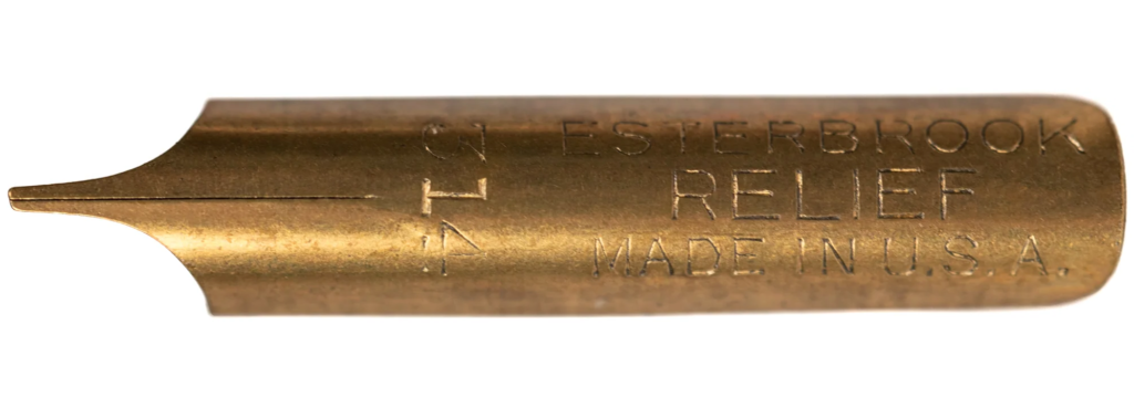
The Esterbrook #314 Relief, once a common dip nib for clerks and calligraphers, has become a relic of sorts – sought out by collectors, hoarded by a few, and imitated by many.
In online fountain-pen groups, you’ll often see posts like:
“Picked up a vintage #314. Writing with it feels like channeling Tolkien.”
It’s romantic exaggeration, but not far from the truth. The nib’s oblique cut and firm tip give exactly the line variation visible in Tolkien’s manuscripts – thick verticals, whisper-thin horizontals, a rhythm that looks deliberate even when it’s spontaneous.
Modern writers rediscover this the moment they dip a pen into ink. It slows them down. It demands intention. For a few lines, they understand what Tolkien meant when he said that creating languages was like “discovering” them – that the act of writing can feel like archeology.
Fountain Pens Join the Quest
Of course, most of us don’t have the patience (or ink-stained fingers) for constant dipping.
That’s where the Osmiroid 65 and its descendants come in – fountain pens fitted with italic or oblique nibs that mimic the calligraphic line of a dip pen. Osmiroid, a British company, became the quiet hero of Tolkien enthusiasts. Their pens offered a portable version of the same precision.
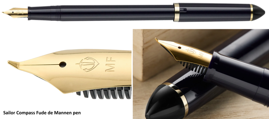
Today, modern equivalents abound. The Pilot Parallel, Lamy Joy, and Sailor Fude de Mannen each offer their own interpretation of Tolkien’s style. Ironically, the Japanese “fude” nib – invented just after his time – recreates that same graceful variation he achieved manually. Calligraphers experimenting with these pens soon discover that Tolkien’s magic wasn’t in the tool – it was in the patience. His steady line came from a scholar’s discipline, not a craftsman’s trick.
The Inked Pilgrimage
Fountain-pen forums have become small pilgrimage sites for fans of his craft. Threads dissect ink choices (“Would Tolkien have used iron-gall or sepia?”), paper textures, and nib angles. Some even share side-by-side recreations of his letters – not the words, but the motion of his script.
It’s an oddly fitting homage. Tolkien’s world was built by a man who cared about etymology, about how a single vowel could hold centuries of history. His readers now care about whether his ink dried blue-black or turned brown with oxidation. It’s devotion by another name.
Beyond Aesthetic
What drives people to copy Tolkien’s handwriting isn’t just admiration – it’s a longing for his rhythm. There’s a meditative quality in writing slowly, in watching ink spread and settle, in feeling the slight resistance of paper.
In an age where writing has become frictionless, his process offers something sacred. You can’t rush it. The pen dictates the tempo. Each letter becomes an act of choice. And somewhere in that slowness, you start to feel what Tolkien must have felt: that writing is not transcription, it’s translation – from the imagination to the tangible.
The Makers Return
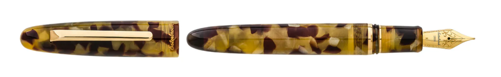
Interestingly, a few modern pen makers have started reviving vintage designs because of Tolkien’s influence. Esterbrook itself, resurrected as a brand in recent years, has released italic nibs inspired by its 1930s predecessors. Pilot and Sailor market “heritage” calligraphy pens with oblique cuts reminiscent of the ones Tolkien used.
It’s a full-circle moment – an industrial echo of a single man’s handwriting.
From Study to Sanctuary
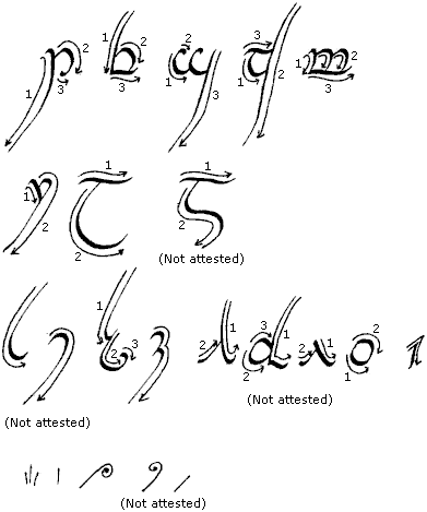
In calligraphy studios around the world, Tolkien’s scripts have become practice lessons. Students trace Tengwar and Cirth not because they know the languages, but because the motion feels graceful. A good nib angle turns Elvish into meditation.
YouTube is full of such quiet videos – the soft scratch of steel, a hand moving in rhythm, a voiceover whispering words from The Silmarillion. It’s as if the act of writing has become a small ritual of faith in beauty.
Reflection
To recreate Tolkien’s handwriting is to rediscover patience.
It’s to accept imperfection as part of creation, to find meaning in the slow making of something beautiful.
He once said that writing was “a labour of discovery.” For him, that discovery came through ink and resistance. For us, it comes through imitation – by tracing his gestures, we learn the weight of thought behind them.
When we dip a nib and draw a letter that curves like an Elvish rune, we aren’t just copying Tolkien. We’re touching the same stillness that once surrounded him – the slow, deliberate silence in which worlds are made.
Essays in this series:
- The Pen of Middle-Earth: Tools that shaped J.R.R. Tolkien’s worlds
- The Pen of Middle-earth, Part I: Ink and Imagination – The Hand That Built Middle-earth
- The Pen of Middle-earth, Part II: The Instruments of Creation – Tolkien’s Pens, Nibs, and Inkwells
- The Pen of Middle-earth, Part III: The Script of Arda – How Tools Shaped Language
- The Pen of Middle-earth, Part IV: Recreating Tolkien – Modern Calligraphers and Fountain Pen Enthusiasts
- The Pen of Middle-earth, Part V: The Slowness of Creation – What Tolkien’s Pen Teaches Us
👁️ 80 views
1 Comment on “The Pen of Middle-earth, Part IV: Recreating Tolkien – Modern Calligraphers and Fountain Pen Enthusiasts”
❣️