

There’s something haunting about J.R.R. Tolkien’s handwriting.
Even before you recognize the words, the lines themselves feel ancient – leaning, curling, tilting like they belong to another age. Each letter seems to remember that the man who wrote it also built entire languages. His pages don’t just say something; they sing.
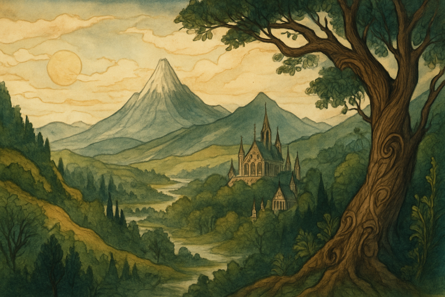
It’s hard not to stare at his manuscripts and imagine the scene: a lamp burning low in an Oxford study, the scratch of nib on paper, an inkwell smudged with the evidence of long nights. Tolkien’s hand moves slowly, deliberately, forming letters with the same care he gave to shaping Elvish phonemes. He wasn’t merely writing stories – he was etching a world into being.
The Living Line
Most of us type. Tolkien didn’t. His imagination flowed through a steel nib, not a keyboard. Every turn of his wrist mattered. You can see it in his letters to publishers – steady, academic, yet always touched with flourish. And in his calligraphic drafts for The Lord of the Rings, the line thickens and thins like a breath, alive with rhythm.
Modern pen enthusiasts often describe this variation as a “fude effect” – that distinct modulation between fine and broad strokes that makes handwriting look sculpted rather than drawn. But the so-called “fude nib” wasn’t yet part of Western pen culture. What Tolkien achieved came from technique and patience, not technology. He controlled his line by angle, not pressure.
A Scholar’s Hand
Tolkien belonged to an era when writing by hand was an act of scholarship, not nostalgia. At Oxford, he corrected student essays and drafted lectures with ink that dried in shades of brown or iron-blue, depending on what the college shop had that week. The English professor’s handwriting was famously meticulous; even his marginalia were neat. But when he turned to his private worlds – the myths of Arda, the histories of Númenor – his script loosened. It became almost decorative, as if language itself wanted to show off.
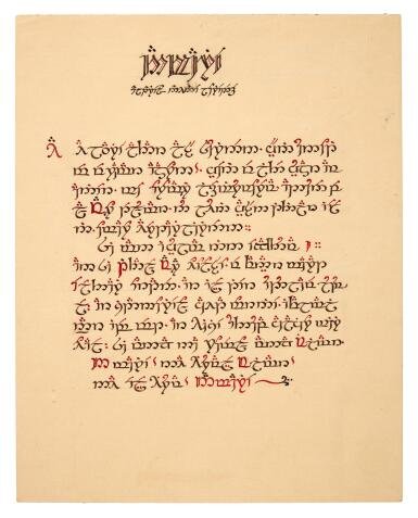
You can trace this shift across his notebooks. The formal Roman characters of his philological notes slowly evolve into the elegant curves that would become Tengwar. The page becomes a bridge between scholarship and art. Tolkien’s pen doesn’t just record; it transforms.
The Weight of the Stroke
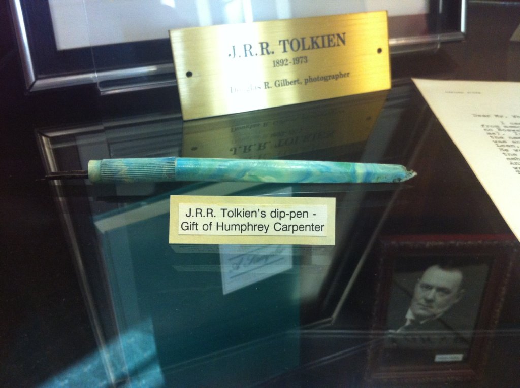
Look closely at his Elvish calligraphy and you’ll notice something subtle: the downstrokes carry weight. They widen at an angle, tapering into hairlines at the top. That’s the signature of a broad or oblique nib, not the flexible “fountain” nibs we associate with flourished handwriting.
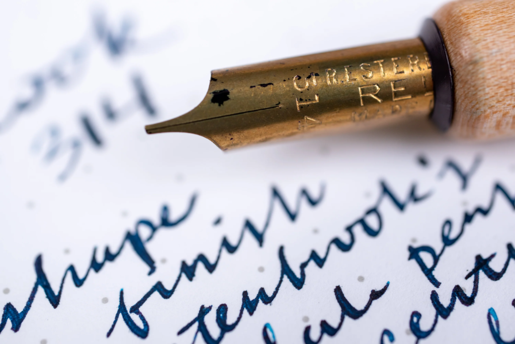
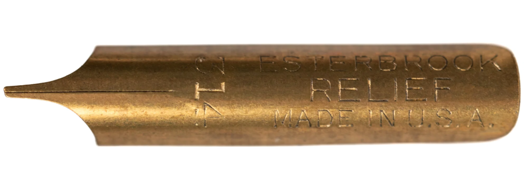
In his time, dip pens ruled the desks of artists and professors alike. Tolkien likely used an Esterbrook #314 Relief nib – a slanted, oblique tip designed for italic writing. It was made to create rhythm without flex: a thick line on one axis, a whisper-thin return on the other. The nib rewarded discipline. Hold it wrong, and the line breaks. Hold it steady, and you get the look of ancient script carved into metal.
There’s an intimacy in that kind of tool. The ink doesn’t wait in a reservoir – it must be dipped, shaken, and wiped before every paragraph. It forces a pause. A breath. And perhaps that pause shaped his sentences too. Tolkien’s prose carries the same cadence: patient, deliberate, and slightly formal, yet warm underneath.
When Language Becomes Art
Few writers have allowed the act of writing to merge so completely with their imagined worlds. For Tolkien, alphabets were not just symbols; they were living artifacts of culture. He designed Tengwar with rules of stroke and spacing suited to an angled nib. The script wasn’t an afterthought – it was optimized for the tools of its age. The way a quill thickens a downstroke informed the way his Elves carved runes or penned songs.
In other words, the physical limitation of his pen helped define the aesthetics of his world. The instrument became part of the mythos. The Elves wrote with grace because Tolkien’s own nib demanded grace.
The Material World of a Myth-Maker
Step back for a moment and picture his study. The dark wooden desk, scattered papers, a worn armchair, the faint smell of tobacco and old books. On that desk sat a simple dip pen, a bottle of ink, and the rough-textured paper he preferred. Nothing fancy. Yet from that small corner of Oxford, entire civilizations flowed outward.
There’s something grounding about that image. In an age when creativity often hides behind screens and shortcuts, Tolkien’s craft reminds us that the simplest tools can summon the grandest worlds. His pen didn’t forgive mistakes. There was no undo key, no auto-correct. Each stroke demanded conviction. Maybe that’s why his invented languages feel so real – they were built one inked syllable at a time.
The Hand That Drew History
It’s easy to think of Tolkien as a dreamer, but he was also a craftsman. His handwriting shows discipline learned from years of linguistic precision. Each map, each page of Elvish script, is an act of cartography – not just of space but of meaning. The same hand that wrote hobbit also designed the swirl in the “R” of Ring.
If you look long enough at his pages, you start to hear the rhythm: the dip into ink, the drag of metal, the soft lift at the end of a word. It’s not just writing; it’s music on paper.
Reflection
Tolkien’s handwriting feels like the echo of an older world – a world where creation took time, and time left its mark. The same patience that shaped The Silmarillion is visible in every letterform. It’s as if the making of Middle-earth required the same ritual as the making of the manuscript itself: repetition, devotion, and love for detail.
We live in an age of instant text. But Tolkien reminds us that slowness has its own kind of magic. His pen was not just a tool – it was a metronome for thought, a compass for imagination. The next time you see one of his pages, don’t just read the words. Trace the strokes. Listen to the pauses between them. That’s where Middle-earth begins.
Essays in this series:
- The Pen of Middle-Earth: Tools that shaped J.R.R. Tolkien’s worlds
- The Pen of Middle-earth, Part I: Ink and Imagination – The Hand That Built Middle-earth
- The Pen of Middle-earth, Part II: The Instruments of Creation – Tolkien’s Pens, Nibs, and Inkwells
- The Pen of Middle-earth, Part III: The Script of Arda – How Tools Shaped Language
- The Pen of Middle-earth, Part IV: Recreating Tolkien – Modern Calligraphers and Fountain Pen Enthusiasts
- The Pen of Middle-earth, Part V: The Slowness of Creation – What Tolkien’s Pen Teaches Us
👁️ 185 views